

Risk Heat Maps: A Powerful Visualization Tool for Harnessing Enterprise Risk Assessment
Introduction
When it comes to managing risks, having a plan in place is critical. One of the most important parts of risk management is performing an enterprise risk assessment. A risk assessment involves examining potential threats, assessing the likelihood of those threats occurring, and determining their potential impact.
Companies use this process to identify areas where they may be vulnerable and develop strategies to mitigate those risks. The results of an enterprise risk assessment are only as useful as the information presented.
Brief Explanation of the Enterprise Risk Management Process
The first step in performing a risk assessment is identifying all potential risks that could impact an organization’s operations, finances, reputation or other aspects. This can include internal and external factors such as natural disasters, cyberattacks, supply chain disruptions, employee errors or malfeasance.
Once identified, each risk must be assessed based on its likelihood and potential impact on the organization if it were to occur.
The final step in the risk assessment process involves developing strategies to mitigate those risks through contingency planning or by taking steps to reduce their likelihood of occurrence.
An effective way to communicate these results with stakeholders is by using visual representations such as risk heat maps, also called heat maps or risk maps.
Importance of Visualizing Risk Assessment Results
Risk assessments can involve large amounts of data that can be difficult for stakeholders to interpret quickly and accurately without clear visual representation. Heat maps are an excellent tool for visualizing this data because they allow you to see patterns quickly and easily while highlighting areas that require immediate attention.
In addition to providing clarity and helping stakeholders understand the results more easily, heat maps also make it easier for organizations to prioritize resources based on the level of threat posed by each area identified in the map.
In short, using heat maps for risk assessments not only makes it easier for stakeholders to understand potential threats but also helps organizations prioritize resources effectively, ensuring that they’re not wasting valuable time and money on low-risk areas.
What are Risk Heat Maps?
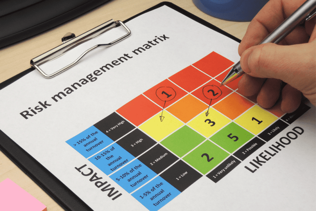
Risk maps are a popular way to visualize data in a graphical format. They display information in a way that is easy for humans to understand, by using colors to represent different values or levels of importance.
They can be used for many purposes, but one of the most common applications is in risk assessment. Their purpose is to provide an at-a-glance overview of the data being presented.
In risk assessment, this means showing the likelihood and potential impact of various risks in a clear and concise manner. By using colors to represent different levels of risk, stakeholders can quickly identify high-risk areas and prioritize resources accordingly.
Definition and Purpose of a Risk Heatmap
A heat map is a visual representation of data that uses colors to indicate the value or level of importance of each data point. The colors used are based on a gradient scale, with darker colors indicating higher values or greater importance.
In risk assessment, heat maps are used to show the likelihood and potential impact of various risks. For example, if there is a high likelihood that a certain risk will occur and the potential impact is severe, that risk would be represented by a dark red color on the heatmap.
Their purpose for risk assessment is to provide stakeholders with an easy-to-understand summary of the risks facing their organization. By visualizing these risks in this way, stakeholders can quickly identify areas where action needs to be taken.
Types of Heat Maps
There are several types of heat maps that can be used for different purposes:
· Density: Shows where there are concentrations or clusters within large sets of data.
· Choropleth: This type uses color-coded regions (like countries or states) based on data values.
· Treemap: Shows hierarchical data as nested rectangles, where the size of each rectangle represents the value of the data.
· Calendar: Used to show patterns in data over time, such as employee absenteeism or website traffic.
Each type has its own strengths and weaknesses, and the choice of which to use will depend on the specific needs of the organization and the nature of the data being analyzed. In risk assessment, density and choropleth heat maps are commonly used to identify high-risk areas and potential threats.
How to Create a Heat Maps for Risk Assessment Results

Gathering Data and Identifying Key Risks Using a Risk Matrix
The first step in creating a heat map for risk assessment is to gather data and identify key risks. This can include reviewing incident reports, conducting interviews with stakeholders, and analyzing historical data.
It’s important to ensure that all relevant information is collected and that potential risks are thoroughly evaluated. Once you have identified the key risks, it’s important to prioritize them based on their potential impact and likelihood.
This can be done through a risk matrix or other prioritization tools. This will help ensure that the most critical risks are given the appropriate attention.
Choosing Appropriate Software or Tools for Creating Heat Maps
After gathering data and identifying key risks, the next step is to choose appropriate software or tools for creating heat maps. There are many different software options available, ranging from free online tools to more comprehensive enterprise-level solutions.
When choosing software or tools, it’s important to consider factors such as ease of use, flexibility in customization, and compatibility with other systems. Some popular options include Excel add-ons like Heatmap by Microsoft Office AppSource or specialized heat mapping software like Tableau.
Setting up Visualization Parameters (Color Coding, Scale etc.)
Once you have chosen your preferred software or tool for creating heat maps, it’s time to set up visualization parameters such as color coding and scale. These parameters play an essential role in effectively communicating the results of your risk assessment process. Color coding should be intuitive and easy-to-understand so that stakeholders can quickly identify high-risk areas.
For example, using red colors for high-risk areas and green colors for low-risk areas may be effective. In addition to color coding, setting up an appropriate scale helps provide context for the results displayed on the heatmap.
Scales can be logarithmic or linear depending on the data set used. When setting up scales, it’s important to choose appropriate ranges that allow for effective visualization of all the data points.
Interpreting the Results From a Heat Maps
Heat maps are powerful visual tools that can help you understand the risks involved in your business or project. When interpreting the results from a heat map, it is important to understand the color coding and scale used.
Typically, lighter colors signify lower risk levels, while darker colors indicate higher risks. The exact color scale used may vary depending on the software or tool used to generate the heat map.
Understanding the Color Coding and Scale Used in the Heat Map
To truly make sense of a risk assessment heat map, you need to know how to read its colors and scale. This means understanding what each shade represents (low, medium, or high risk) as well as where on the scale these colors fall. Your heatmap’s creator should inform you about this.
For example, if low-risk areas are colored yellow and high-risk areas are colored red, then it is likely that shades of orange will represent moderate-risk areas. Additionally, knowing exactly how many steps there are between low and high risk levels can help you better understand your data.
Identifying High-Risk Areas and Potential Threats
Another important aspect of interpreting a heat map is identifying high-risk areas and potential threats. These are typically represented by darker shades on your heatmap. By pinpointing these areas early on in your risk assessment process, you can take action to minimize their impact.
High-risk areas could be anything from a problematic vendor relationship to an unreliable network infrastructure. Identifying these risks early on can help you prioritize which issues require immediate attention versus those that can be addressed at a later date.
Analyzing Trends Over Time
Analyzing trends over time is an important part of understanding your data in-depth using heat maps. By monitoring changes over weeks or months (or even years), you can see patterns that might not be immediately apparent. For instance, a sudden spike in high-risk areas could indicate that a new threat has emerged, while a reduction of risk could signify that your mitigation efforts are working.
Analyzing trends can also help you forecast future risks and make informed decisions about how to allocate resources and prioritize actions. By understanding the underlying factors that drive your risks, you can develop more effective strategies to mitigate them over time.
Benefits of using Heat Maps for Risk Assessment

Improved Communication with Stakeholders
One of the main benefits of using heat maps to visualize the results of a risk assessment process is that it improves communication with stakeholders. Heat maps provide a clear visual representation of risks and potential threats, which can help stakeholders easily understand the results of the assessment.
This increased understanding leads to better communication among team members and decision-makers, as everyone is on the same page regarding what risks are present and how they might impact the project or organization.
Better Decision-Making Based on Clear Visual Representation of Risks
Another advantage of using heat maps for risk assessment is that it allows for better decision-making based on a clear visual representation of risks. When presented with data in a visual format, our brains are better able to process and understand complex information.
By using heat maps to display risk assessment data, organizations can make more informed decisions about how to manage risks and allocate resources.
For example, if a heat map shows that there are several high-risk areas within a project or organization, decision-makers can use this information to prioritize their efforts in addressing these areas first.
Conversely, if there are low-risk areas that require minimal attention, resources can be shifted towards other areas where they will have greater impact.
Ability to Prioritize Resources More Effectively
Using heat maps for risk assessment allows businesses and organizations to prioritize their resources more effectively. By identifying high-risk areas through the use of heat maps, businesses can allocate resources towards these areas first in order to mitigate potential damage or loss.
This approach helps ensure that critical issues are addressed before less important ones. Heat maps also allow organizations to track trends over time by displaying changes in risk levels over multiple assessments.
This tracking enables businesses and organizations to identify patterns or trends related to specific types of risks and adjust their strategies accordingly. By using heat maps in this way, businesses can prioritize their resources more effectively and ensure that they are making the most impactful decisions possible.
Tips to Effectively Use Risk Heat Maps in Risk Assessment

Regularly Updating Data to Ensure Accuracy
One of the most important tips for using heat maps in risk assessment is to regularly update your data. As we all know, risks and threats are constantly evolving, so it’s important to keep your data up-to-date to ensure the accuracy of your analysis.
This means reviewing and analyzing data on a regular basis, and updating your heat map accordingly.
It’s also important to ensure that you’re using accurate data sources when updating your heat map. This means utilizing reliable sources such as industry reports, government statistics, and internal company data.
You should also consider incorporating external feedback from stakeholders such as customers or employees who may have valuable insights into potential risks. Ultimately, regularly updating your heat map will help you stay ahead of any potential risks and threats and will allow you to make more informed decisions about how best to allocate resources.
Incorporating Feedback from Stakeholders into Future Assessments
Another tip for effective use of heat maps in risk assessment is to incorporate feedback from stakeholders into future assessments. These can include customer feedback surveys or employee suggestion boxes.
By gathering feedback from those who interact with the business on a daily basis, you can gain valuable insights that can help identify areas where risks exist but may not have been identified through other means.
Incorporating stakeholder feedback can also help increase buy-in from employees which can lead to increased engagement in the risk assessment process.
By involving stakeholders in the process, you’re showing them that their opinions matter which can help build trust between employees and management. Incorporating stakeholder feedback can also improve communication around potential risks by ensuring everyone feels invested in identifying and mitigating those risks.
Conclusion
Heat maps are an effective tool for visualizing the results of a risk assessment process. By using color coding and a scale, heat maps provide a clear understanding of potential threats and high-risk areas.
This information can be crucial in making better decisions, prioritizing resources, and improving communication with stakeholders. One of the main benefits of using heat maps in risk assessment is that they make it easy to identify trends over time.
This means that you can easily track changes in risks and respond accordingly. With heat maps, you can quickly see how risks have evolved, which allows you to adjust your strategy to better mitigate these risks.
Another benefit of using heat maps is that they provide a visual representation of data. This makes it easier for stakeholders to understand the results and the importance of taking action.
When stakeholders can see the data presented in an easily digestible format such as a heat map, it is more likely that they will take the necessary steps to address potential threats. In short, by utilizing heat maps in your risk assessment process, you will be able to make better-informed decisions by having access to clear and concise information about risks.
Heat maps are an excellent tool for identifying high-risk areas and potential threats so that you can prioritize resources effectively and communicate these risks with your team or stakeholders effectively. So why not give it a try today?
FAQs
Q: What are Risk Heat Maps?
A: Risk Heat Maps are powerful visualization tools that help in harnessing enterprise risk assessment. They provide a graphical representation of the risks based on their likelihood and impact.
Q: What is the purpose of Risk Heat Maps?
A: The purpose of Risk Heat Maps is to visually depict the types of risk an organization is facing and the potential impact and likelihood of each risk. It helps in calculating the overall risk and enables organizations to make informed strategic decisions.
Q: How are Risk Heat Maps created?
A: Risk Heat Maps are created by plotting the identified risks on a heat map. The risks are evaluated based on their impact and likelihood, and then represented in a quadrant or a risk matrix. Each quadrant represents a different level of vulnerability and helps prioritize risk mitigation efforts.
Q: How can a Risk Heat Map help a company?
A: A Risk Heat Map can help a company by providing a visual representation of its risk landscape. It enables risk analysts and senior management to identify and assess the impact of risks in one glance. This helps in making informed decisions and implementing appropriate risk mitigation strategies.
Q: What are the benefits of using a Risk Heat Map?
A: Using a Risk Heat Map offers several benefits. It helps in understanding the overall risk exposure of an organization, enabling better resource allocation and risk management. It also facilitates effective communication of risks to stakeholders and supports data visualization for risk analysis.
Q: How can a Risk Heat Map be used for cyber risk?
A: Risk Heat Maps can be used for cyber risk by mapping the potential risks related to cybersecurity and plotting them on the heat map. This allows organizations to identify and prioritize cybersecurity measures and allocate resources accordingly.
Q: What is a risk score?
A: A risk score is a numerical value assigned to each identified risk. It represents the level of impact and likelihood associated with the risk. Risk Heat Maps utilize risk scores to plot risks on the map based on their severity.
Q: How does a Risk Heat Map support risk mitigation?
A: A Risk Heat Map supports risk mitigation by providing a clear visualization of the risks and their potential impact. This helps organizations in identifying areas that require immediate attention and implementing effective risk mitigation strategies.
Q: What are the key factors to consider when creating a Risk Heat Map?
A: When creating a Risk Heat Map, it is important to consider factors such as the organization’s risk appetite, the impact of risks on strategic decisions, and the availability and reliability of risk data. These factors help in creating a comprehensive and accurate visualization of the risks.
Q: How can a Risk Heat Map be used for internal control?
A: A Risk Heat Map can be used for internal control by plotting the identified risks related to internal processes and controls. It helps in identifying areas of weakness or vulnerability and supports the implementation of effective internal control measures.
Q: Who can benefit from a Risk Heat Map?
A: A Risk Heat Map can benefit various stakeholders within an organization, including risk experts, senior management, and decision-makers. It provides a holistic visualization of risks, which aids in understanding the overall risk landscape and making informed decisions.